小探animation-timing-function中的steps属性
合抱之木,生于毫末;九层之台,起于垒土;千里之行,始于足下。——《道德经》
今天翻阅《css揭秘》,看到一章关于用css3实现饼图效果。代码如下:1
2
3
4
5
6
7
8
9
10
11
12
13
14
15
16
17
18
19
20
21
22
23
24
25
26
27
28
29
30
31
32
33
34
35<div class="pie" style="animation-delay: -20s"></div>
<div class="pie" style="animation-delay: -60s"></div>
<style>
@keyframes spin {
to { transform: rotate(.5turn); }
}
@keyframes bg {
50% { background-color: #655; }
}
.pie {
display: inline-block;
position: relative;
width: 200px;
height: 200px;
background-color: yellowgreen;
background-images: linear-gradient(to right, transparent 50%, #655 0);
}
.pie::before {
content: '';
position: absolute;
top: 0;
left: 50%;
width: 50%;
height: 100%;
background-color: inherit;
border-radius: 0 100% 100% 0 / 50%;
transform-origin: left;
animation: spin 50s linear infinite, bg 100s step-end infinite;
animation-delay: inherit; /* 由于不能通过js为伪元素赋值,所以此处通过inherit继承父元素上的值 */
animation-play-state: paused;
}
</style>
书上的解释很详细,但却没有解释step-end到底是什么,于是,从没见过这个值得我,一脸的懵逼。在w3cschool上也没找到这个值。于是继续搜索,在博客园找到了相关博文。
概括下,大概就是…
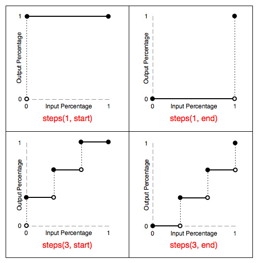
- steps 函数指定了一个阶跃函数,它接受两个参数。
- 第一个参数接受一个整数值,表示两个关键帧之间分几步完成
- 第二个参数有两个值< start > or < end >。默认值为< end >
- step-start 等同于 step(1, start)。step-end 等同于 step(1, end)
无码言屌:1
2
3
4
5
6
7
8
9
10
11
12
13
14
15
16
17
18
19
20
21
22
23
24
25
26
27
28
29
30
31
32
33
34
35
36
37
38
39<div class="content"></div>
<style>
@keyframes cw {
0% {
width: 0%;
}
50% {
width: 50%;
}
100% {
width: 100%;
}
}
.content {
width: 0;
height: 50px;
background-color: yellowgreen;
/**
* 猜猜此时,结果会怎样?
* width直接变为50%然后再变为100%
* animation: cw 10s step-start infinite;
*/
/**
* width先变为0%然后变为了50%
* animation: cw 10s step-end infinite;
*/
/**
* width先变为25%然后50%然后75%最后100%
* animation: cw 10s steps(2, start) infinite;
*/
/**
* width先变为0%然后25%然后50%最后75%
* animation: cw 10s steps(2, end) infinite;
/
}
</style>
综上可以发现,steps是作用于关键帧之间的,而不是整个动画。第一个参数将两个关键帧又细分为了几帧。第二个参数决定从一帧到另一帧的中间间隔是用开始帧还是结束帧来进行填充。start表示直接用结束帧进行中间填充,end表示直接用开始帧进行中间填充。
最后再上张神图,一图胜千言: